THE SCREENING CALL
Setting the Stage
Sketching a Health Narrative
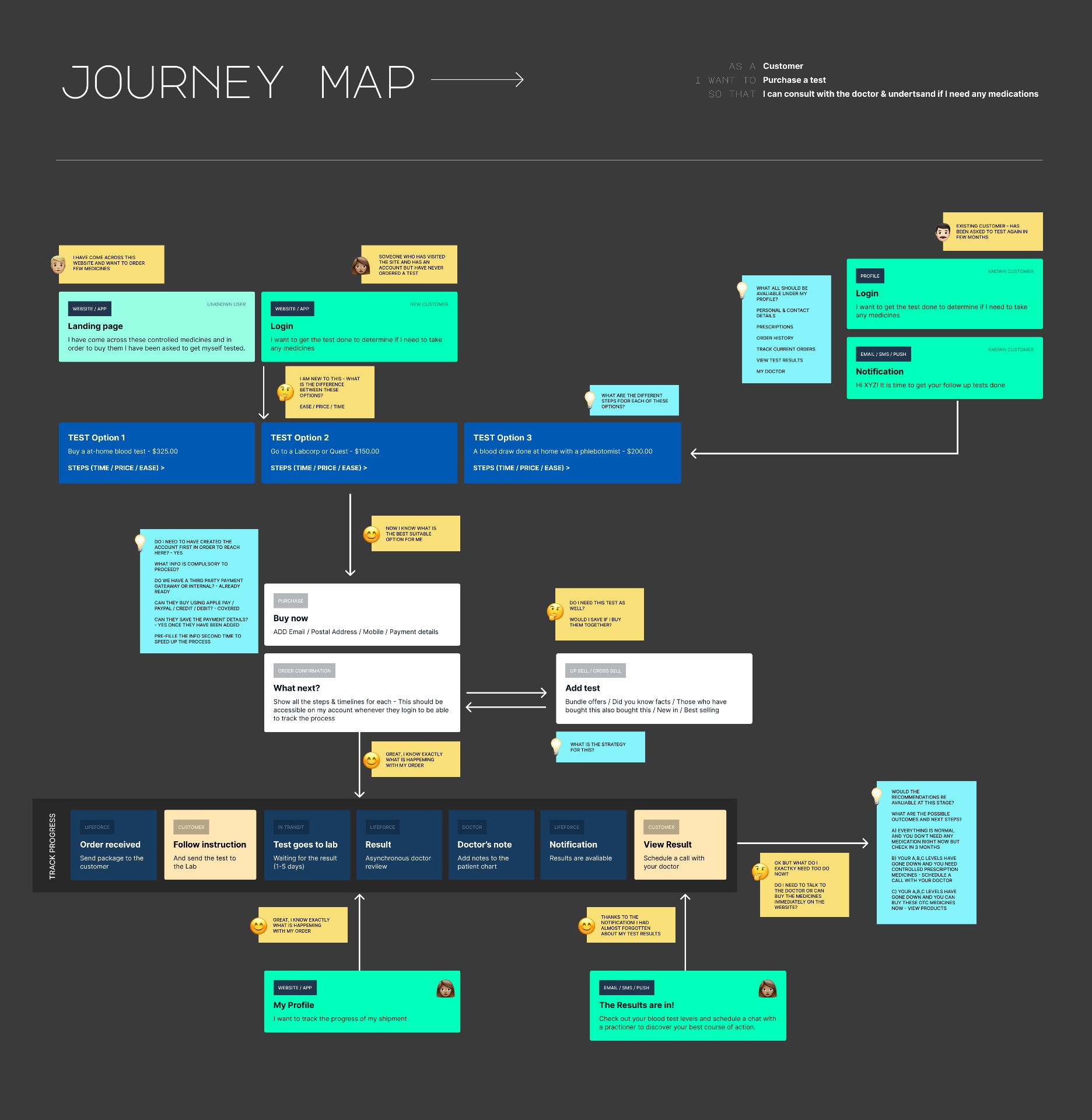
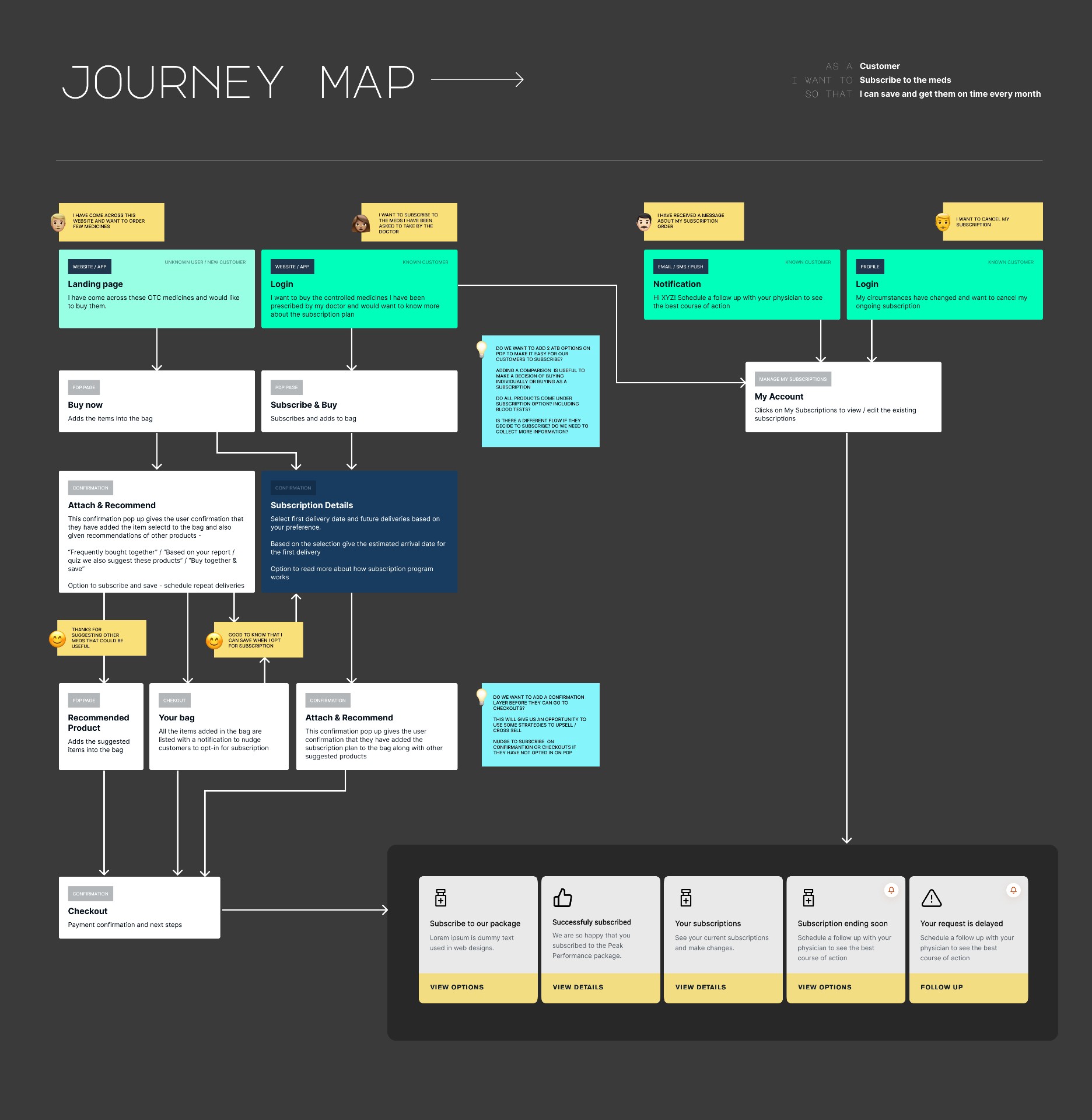
I began by mapping the actual journey—how a member moves from blood draw to understanding results, from doctor guidance to a confident next step. Journey maps became our first shared language. They surfaced friction we could tackle immediately: lab data trapped inside 15‑page PDFs; medical terminology that froze non‑experts; a subscription and refill process that relied on phone calls and manual nudges.
What I heard most from early users was a quiet anxiety: “I’m staring at numbers I don’t understand—am I okay?” The job of design was to replace that anxiety with clarity and momentum.
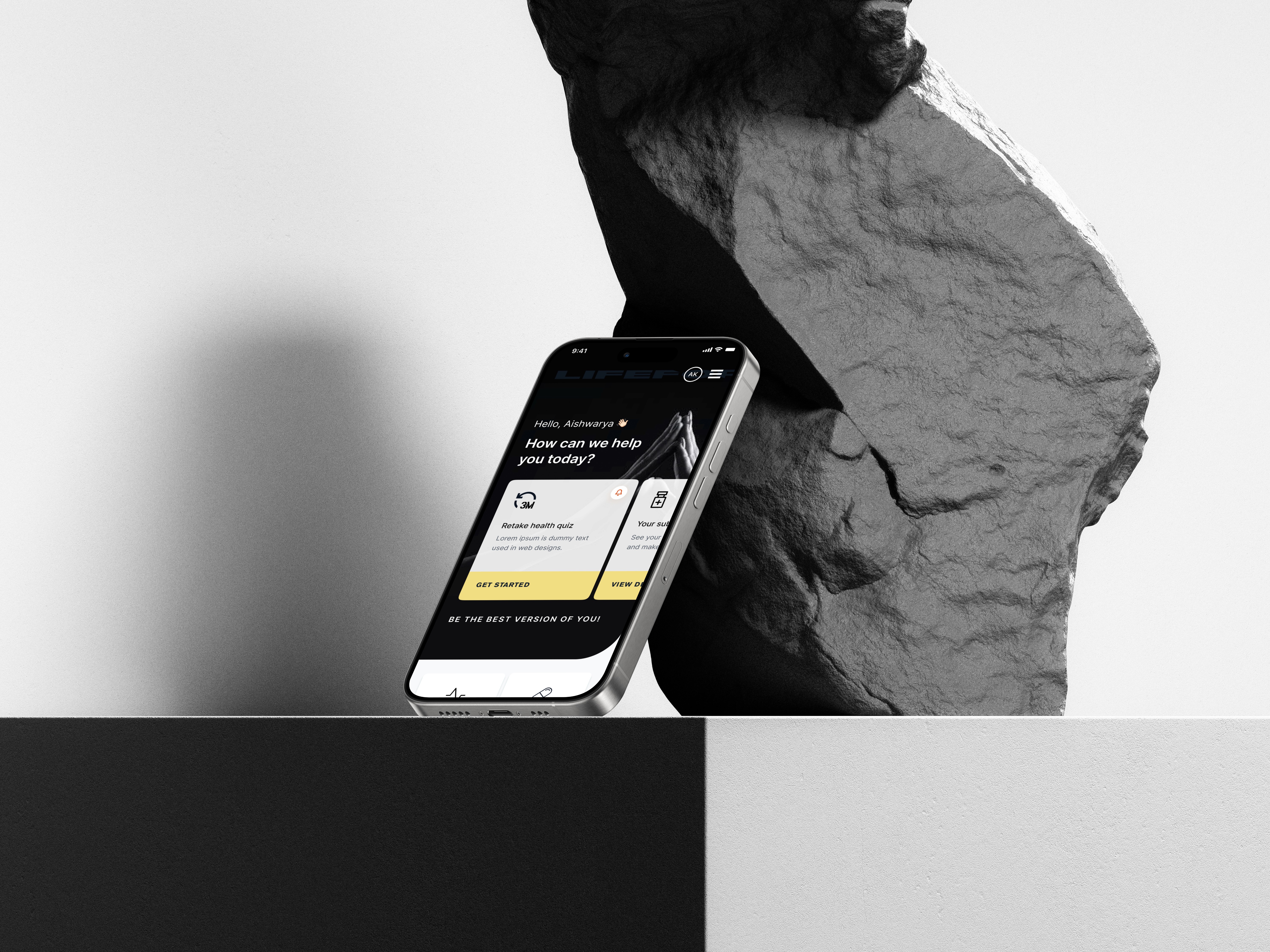
Diagnosing the Old World
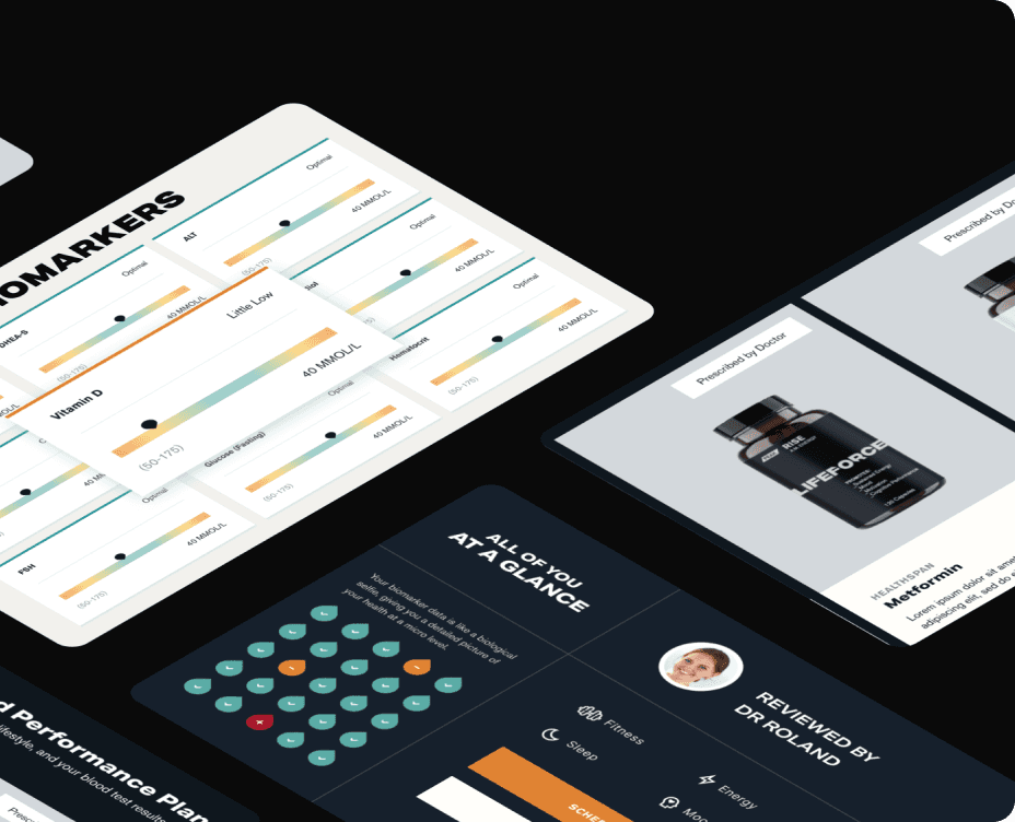
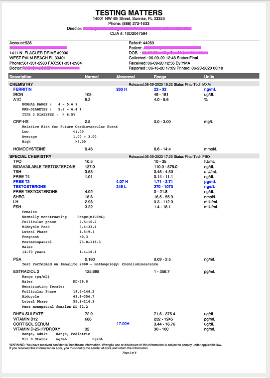
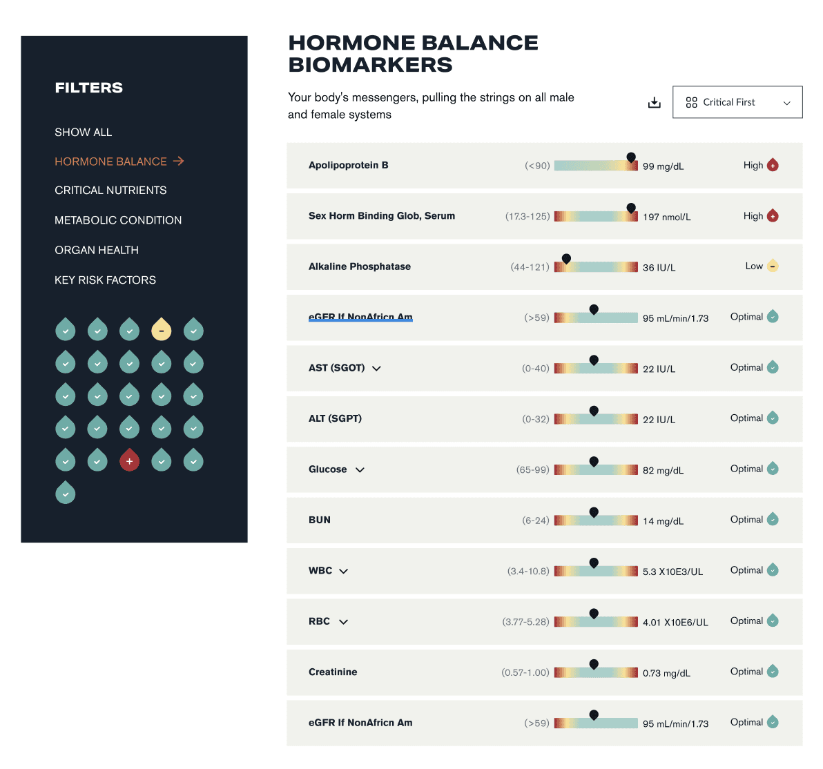
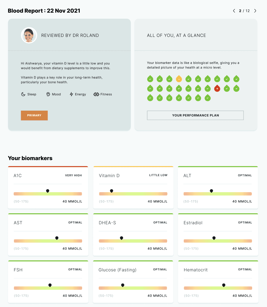
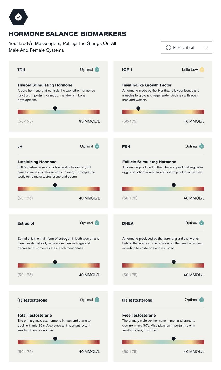
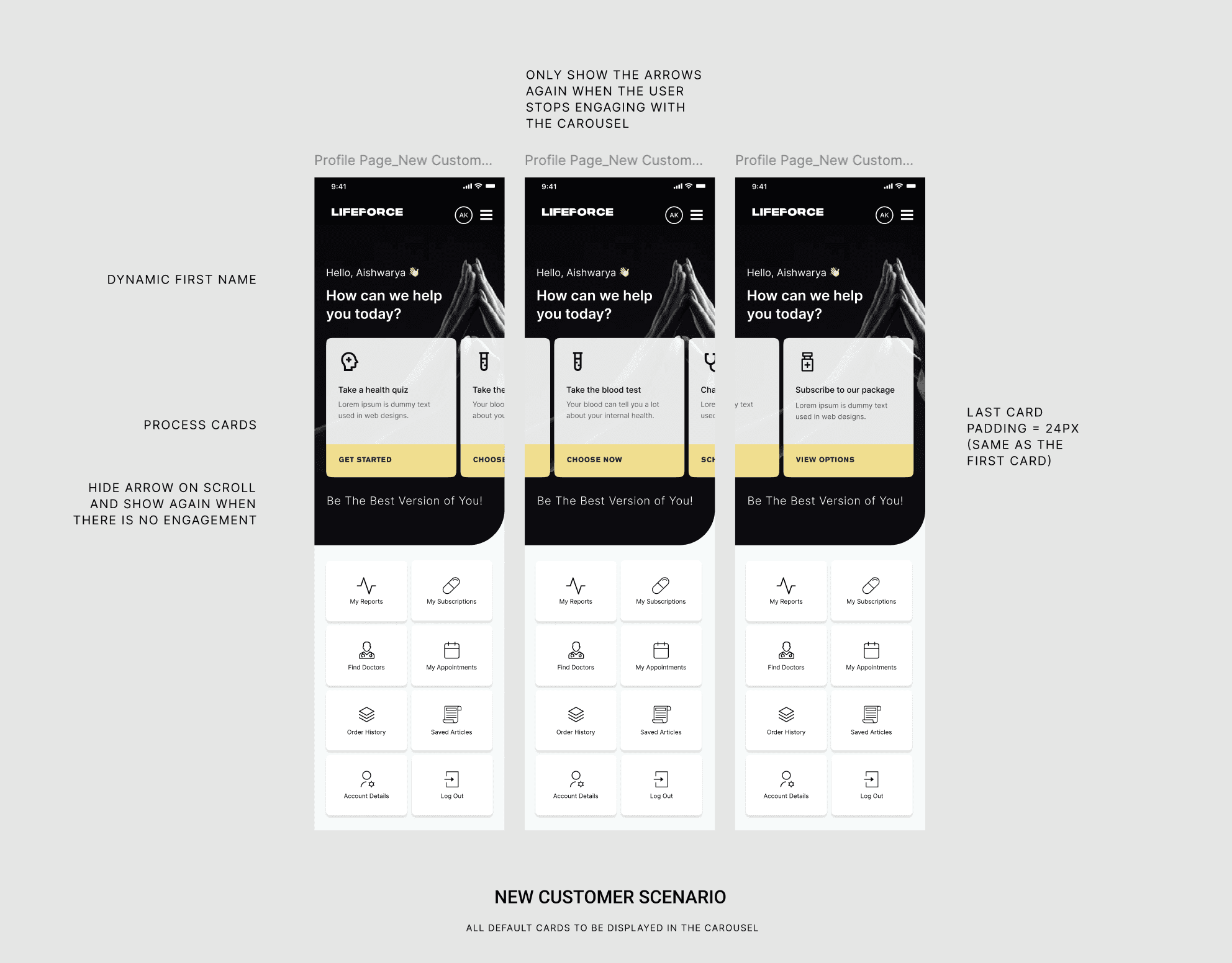
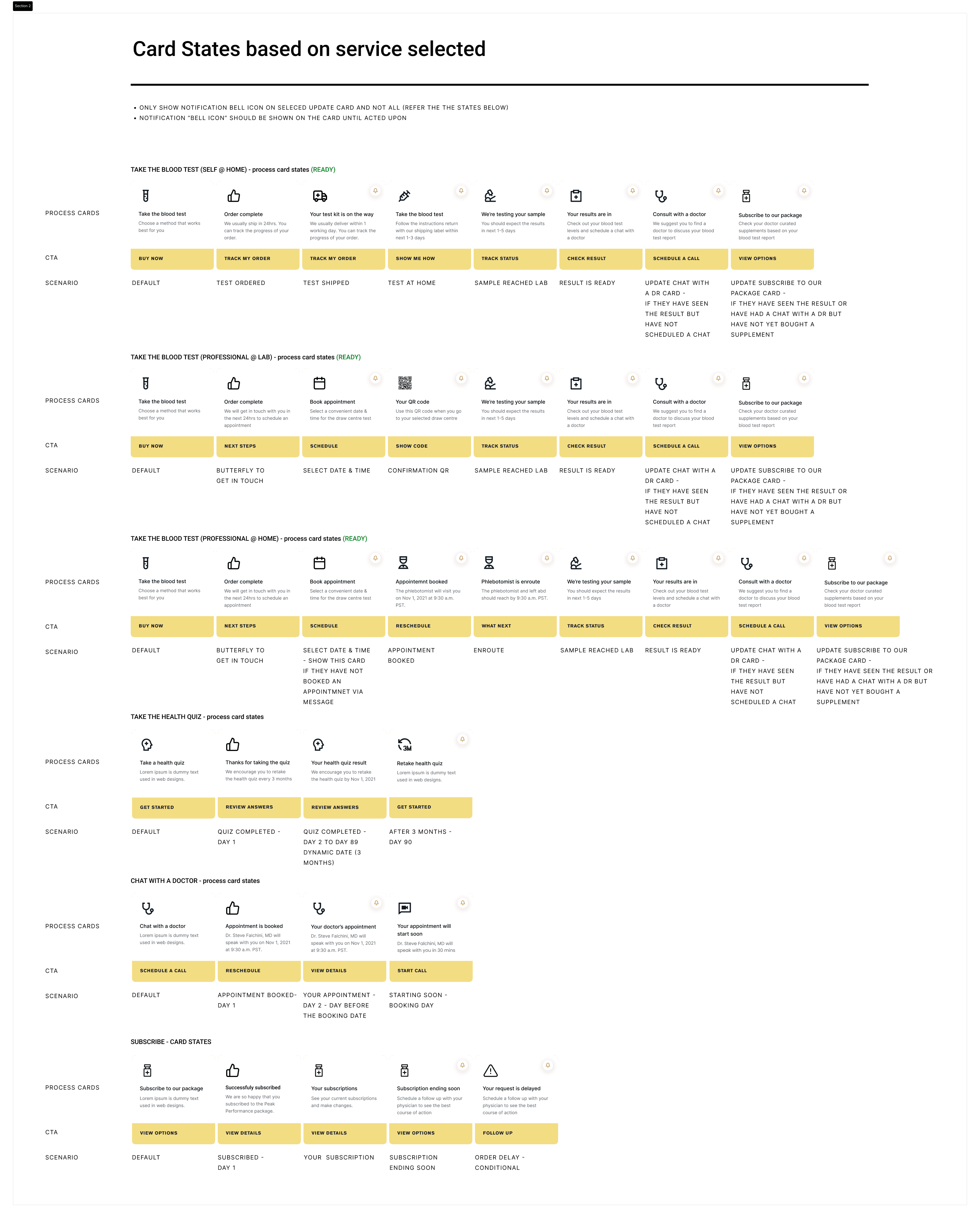
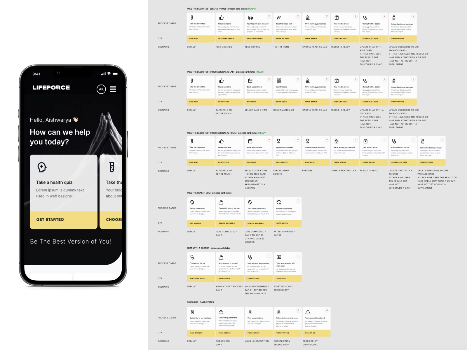
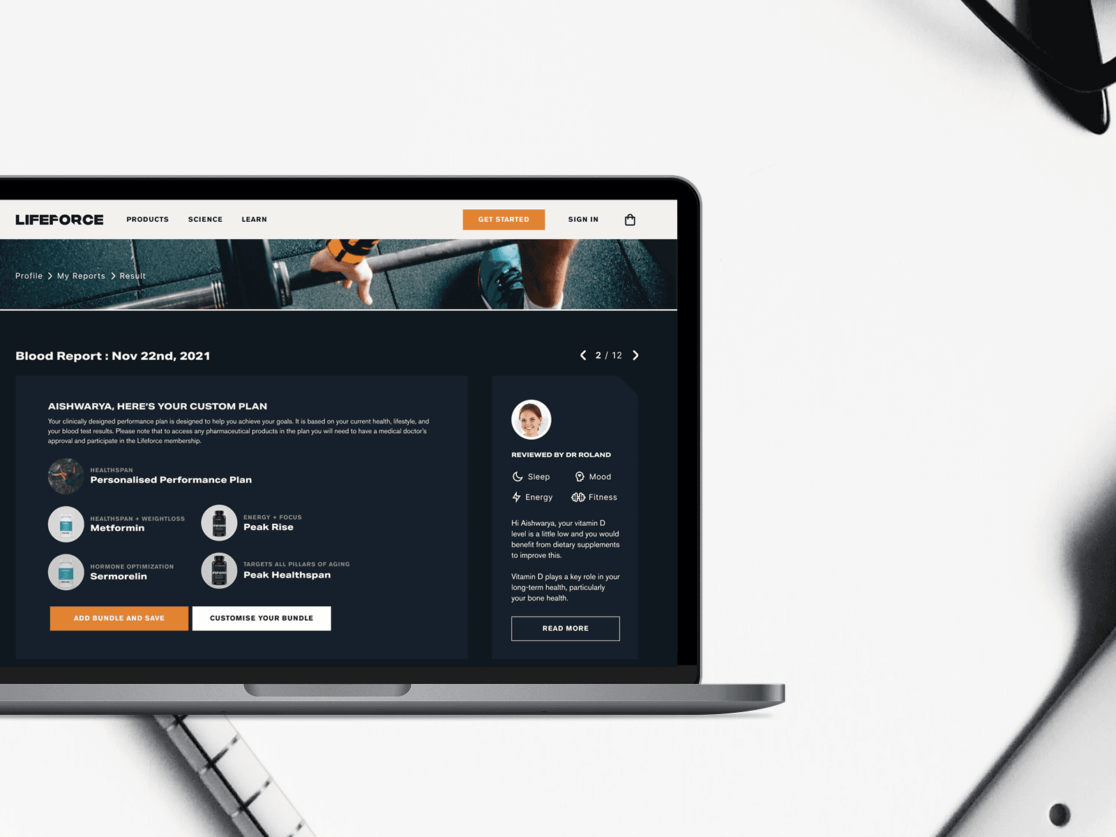
Started with the hardest part: the report. The traditional lab printout was accurate but unreadable. We rebuilt it as a digital, visual experience—a living dashboard where biomarkers were color‑coded, trend‑aware, and explained in plain language. Gauges replaced dense tables; spark‑lines told a story over time; “What this means” drawers translated jargon into actions a person could actually take.
The goal wasn’t to hide complexity; it was to orchestrate it. Members needed just enough information to decide what to do next—and a clear path to do it.
Before: 15‑page, jargon‑heavy lab PDFs; hard to scan, harder to act on.
After: Interactive dashboard with color‑coded biomarkers, plain‑language insights, and personalized recommendations.
Building the Foundation


BUILDING WHILE WE RUN
Working in a sprint, communicating like a marathon
To keep momentum, I shipped progress as narrative—short Loom walkthroughs that turned Figma frames into stories anyone could follow. Those weekly videos aligned founders, engineers, and advisors without piling on meetings. They also created a living record of decisions: why we rejected a path, how we handled a tricky edge case, where we were betting on impact.
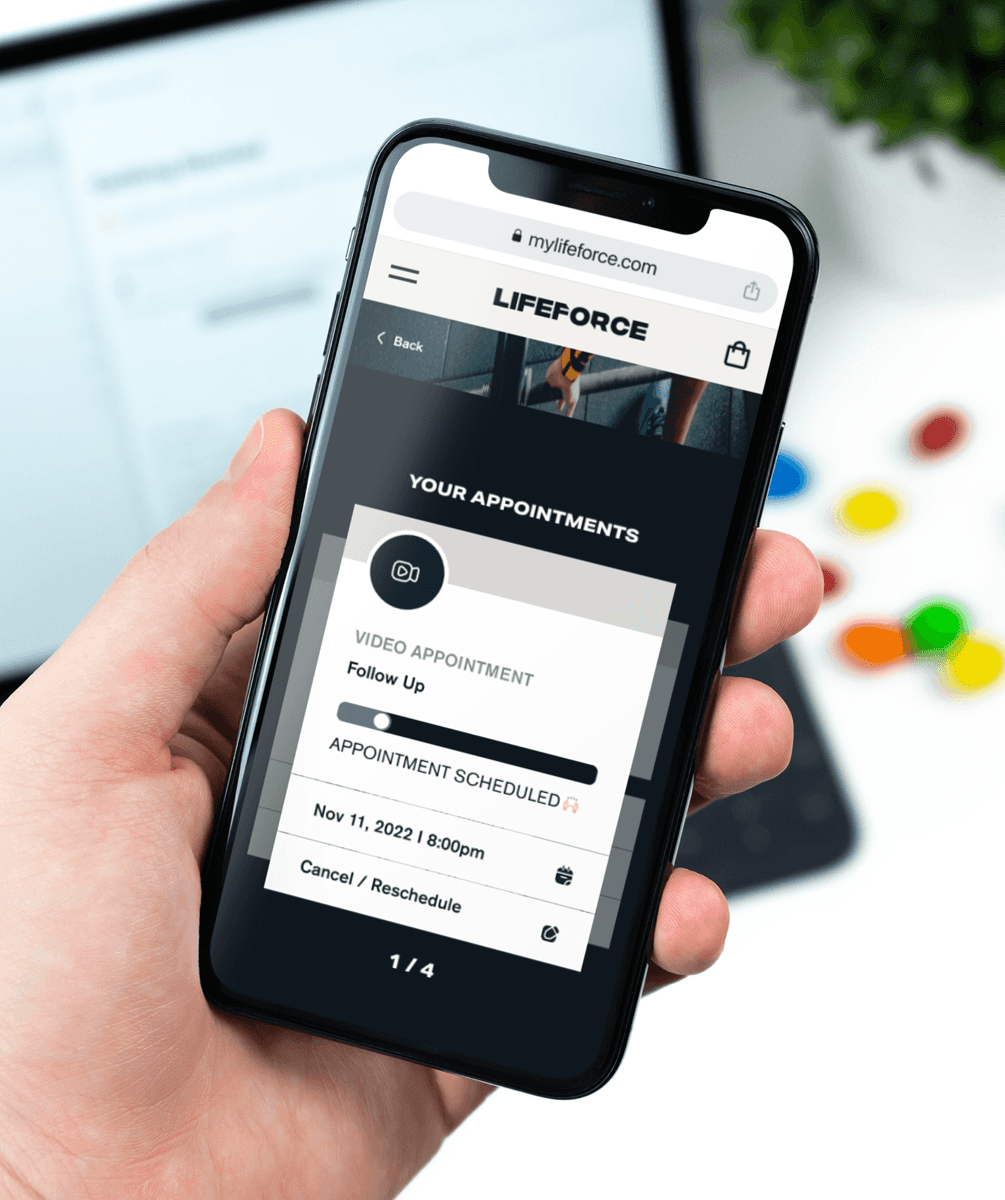
We delivered on schedule: subscription and account were rebuilt for self‑service; the report experience moved from static to interactive; product pages connected guidance to checkout with far fewer steps. The reactions after launch were a reminder of why we were building this in the first place. Members stopped talking about numbers and started talking about decisions. They knew what to do next—and they could do it themselves.
OUTCOME
The market noticed, too. The polished, human‑centred product narrative became a centerpiece of the company’s story to investors. In the two years following launch, Lifeforce secured a $12M Series A, a milestone covered here:
BusinessWire — Lifeforce Raises $12M Series A to Become the World’s Most Effective Health
Explore - The live platform
What changed—for users and for the business
For members, the platform turned a confusing medical artifact into a daily companion: a color‑coded health view that explained itself, remembered context, and collapsed the gap between advice and action. For the business, the same design choices unlocked self‑serve behaviors that reduced operational friction and amplified trust—exactly the kind of momentum investors look for when they back teams at scale.
LOOKING BACK
This project reinforced a belief I carry into every engagement: great healthcare UX is not about simplifying truth; it’s about sequencing truth. When you present the right signal at the right moment—and pair it with a frictionless action—you turn information into agency. That’s what we built at Lifeforce in four focused months, and it’s why design became a meaningful part of the company’s $12M story.